ERSILIA - THUMBNAILS
ERSILIA
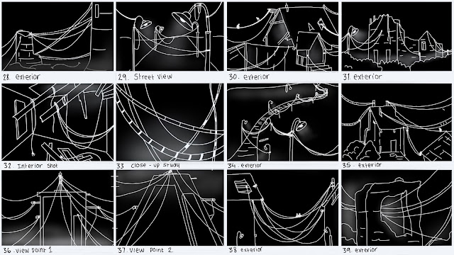
These are my thumbnails for Ersilia. I chose to draw this city in only black and white as it would be easier to create and represent the strings. The use of only white lines help add confusion to each drawing, which links to the overall complexity of the strings. I tried to explore different perspectives and viewpoints, as well as various types of structures. If I developed these further, I would start to include tone and thicker lines.


Yes - these are strong - I reckon it might be fun though to go a bit mad in terms of duplicating these images and layering them up a bit in order to get a sense of the complexity of this crazy space - something a bit more...
ReplyDeletehttps://www.pinterest.co.uk/pin/343610646549905371/?lp=true